
Building an UI for bookers
February this year I had the pleasure to work with the team at Artist Exhange improving their gig booking UI and user experience for both buyers and sellers of gigs.
Artist Exhange have dubbed themselves as Spotify for gigs and they are out to simplify the way record companies, agencies, and event organizers communicate and make contracts. Idea is to make the requesting for proposals and proposing as easy as possible and make it easy for event organizers to browse available artists.
Their platform standardizes and makes its transparent to agree on terms of bookings, which can sometimes be a bit too vague in the music industry.
Help with a cumbersome form
Artist Exchange had identified the booking form as the part of their application which will need facelift in the future.
The goal of the project was to improve the booking form and look at general typography of the application.


Readable typography
Artist Exchange is using PT Sans Narrow as their brand typeface, but it was decided that the form wasn’t readable enough with this condensed type. The font on the form was changed to Open Sans.

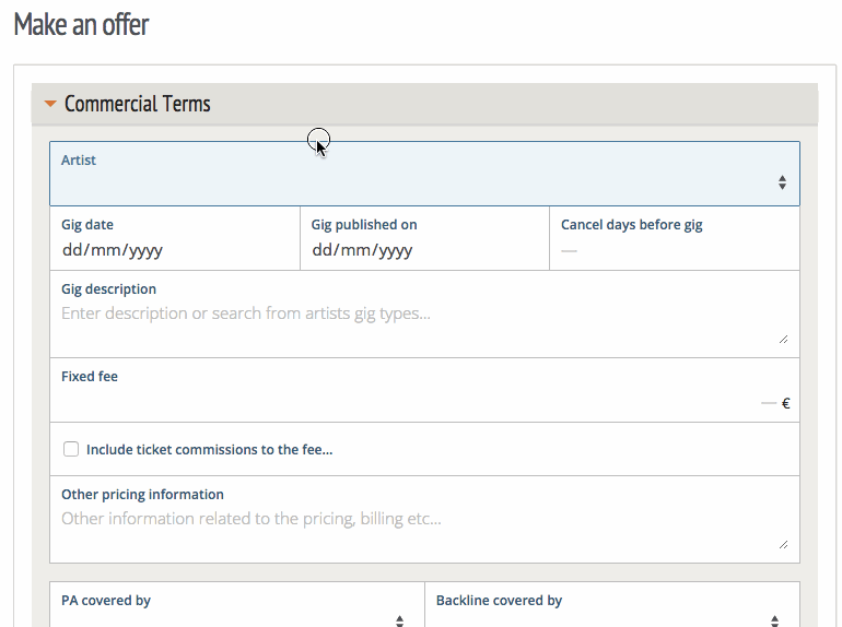
Infield top aligned labels

Regular top aligned labels create more visual clutter and make long forms feel twice as long. As the booking form is quite long, it was important to minimize the visual scanning required to understand the form.
Infield top aligned labels create minimum amount of borders and whitespace and make longer forms seem shorter as the eye has less elements to fixate on.
Idea was to bring a metaphor of an actual paper form and the boxed grid with infield top aligned labels pattern suited this very well.
You can read more about infield top aligned labels at: Why Infield Top Aligned Form Labels Are Quickest to Scan

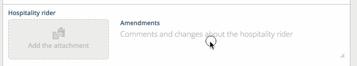
Nicer upload fields
One task was to improve the standard file upload field. We designed an upload field which shows the uploaded file clearly and separates the added files from fields which are not yet added as attachments.
Timeline as an discussion
All steps in the progress of the contract are saved to a timeline and this timeline was restyled to look more like a discussion.

Coffee is for closers
At the end of the project I wanted to add something to the form which would make it especially delightful to close the deal. We all know the sales culture is all about closing, so I wanted to bring an affirming animation from the real world to the form. So the handshake was born.

Lessons
The project was also an exercise of time management, since the timeframe and budget were really tight. It was decided that it is better to work more on a prototype and leave some of the implementation to the in-house team. The team also was conscious of time use and advised me to move on to the next problem when they had enough guidance to finish things themselves.
In addition to working on the UI I think we managed to bring in lessons from Kisko’s tools and practices working with Rails.
The project already had many basics in place, so it was a pleasure to work on and bringing in incremental improvements was easy.
Project facts
- Client: Artist Exchange
- Team: Antti Salonen
What’s your story?
Do you have a project and budget, or are you still looking for possibilities in the digital world?
Tell us about your business and we’ll figure out how we can help you.


We will answer you soon.
